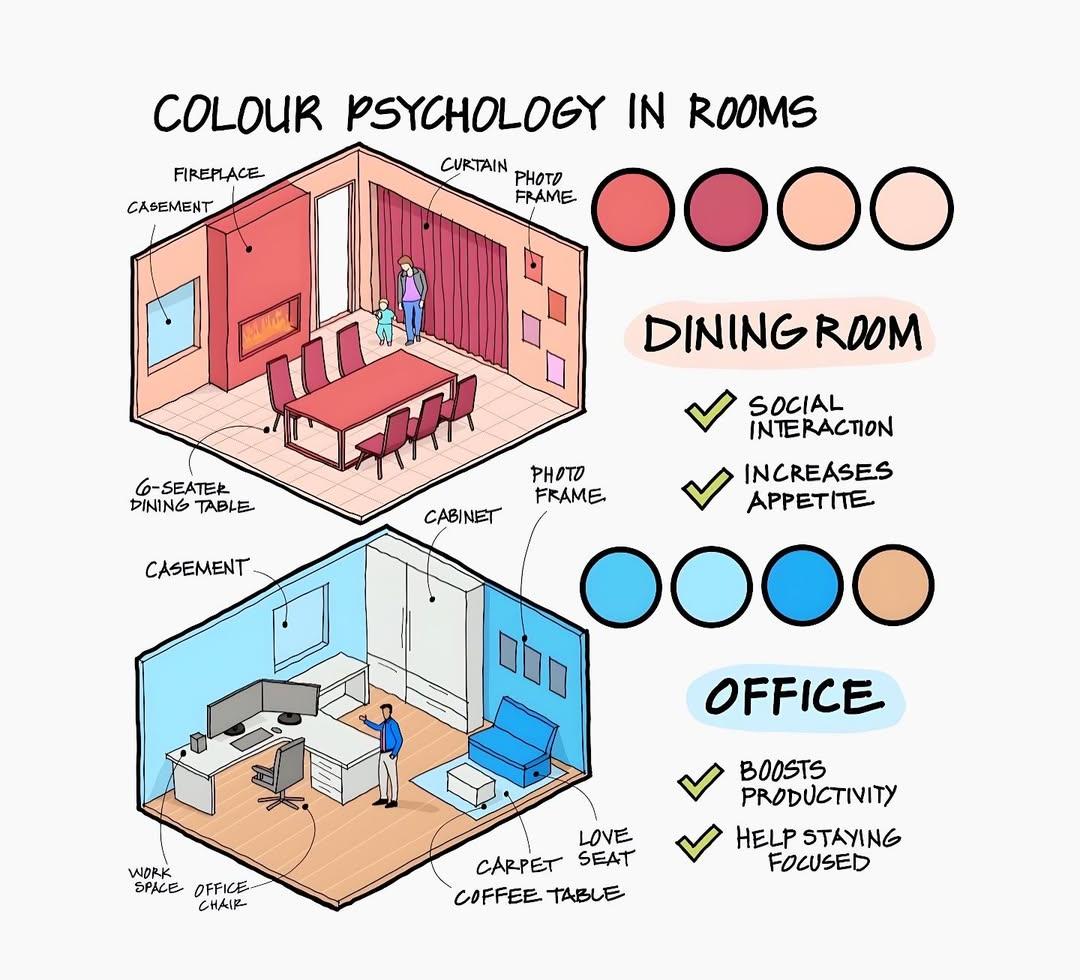
Dining Room
* Illustration: A warm, inviting dining room rendered in perspective.
* Walls: Predominantly deep red, especially the wall with the fireplace.
* Fireplace: A prominent feature on the main wall, also in a reddish hue.
* Dining Set: A “6-SEATER DINING TABLE” (dark wood) surrounded by matching chairs (with reddish upholstery).
* Window: A “CASEMENT” window is visible, letting in natural light.
* Curtain: A large “CURTAIN” in a reddish-brown or burgundy tone covers a wall or window.
* Decor: A “PHOTO FRAME” is on the wall, and a couple of figures are present, suggesting a lived-in space.
* Colour Scheme (Swatches): Four circular swatches range from deep red to lighter reddish-orange/peach, representing the palette used in the room.
* Psychological Effects:
* SOCIAL INTERACTION: Checked with a green tick. Red and warm colors are often associated with energy and stimulate conversation.
* INCREASES APPETITE: Checked with a green tick. Red is known to be an appetite stimulant, making it a common choice for dining areas.
* Overall Impression: The dining room uses warm, rich colors (primarily reds) to create an energetic and social environment, conducive to dining and interaction.
Office Space
* Illustration: A calm and organized office space rendered in perspective.
* Walls: Predominantly light blue, creating a serene backdrop.
* Workspace: A “WORK SPACE” desk with an “OFFICE CHAIR” is set up against a wall with a “CASEMENT” window, suggesting natural light.
* Storage: A large “CABINET” (white) provides ample storage.
* Seating Area: A “LOVE SEAT” (light blue) with a “COFFEE TABLE” and a “CARPET SEAT” (possibly a pouf or cushion) creates a small breakout or relaxation zone.
* Decor: A “PHOTO FRAME” is on the wall.
* Colour Scheme (Swatches): Four circular swatches range from a deeper blue to lighter blues and a light tan/beige, representing the palette used.
* Psychological Effects:
* BOOSTS PRODUCTIVITY: Checked with a green tick. Blue is often associated with calmness, focus, and clarity, which can aid concentration.
* HELP STAYING FOCUSED: Checked with a green tick. Similar to productivity, blue’s tranquil nature helps reduce distractions and maintain focus.
* Overall Impression: The office space utilizes cool, calm colors (primarily blues) to foster an environment of productivity, focus, and clarity.
Conclusion:
The infographic effectively demonstrates the practical application of color psychology in interior design. It clearly shows how chosen color palettes can directly influence the mood and functionality of a room, making them more suitable for their intended purpose. Warm colors (reds) are recommended for social and appetite-stimulating spaces like dining rooms, while cool colors (blues) are suggested for environments requiring concentration and productivity, like offices.
Hi, this is a comment.
To get started with moderating, editing, and deleting comments, please visit the Comments screen in the dashboard.
Commenter avatars come from Gravatar.